Griddle Accessibility: Playing on Mobile, Tablet, and Desktop
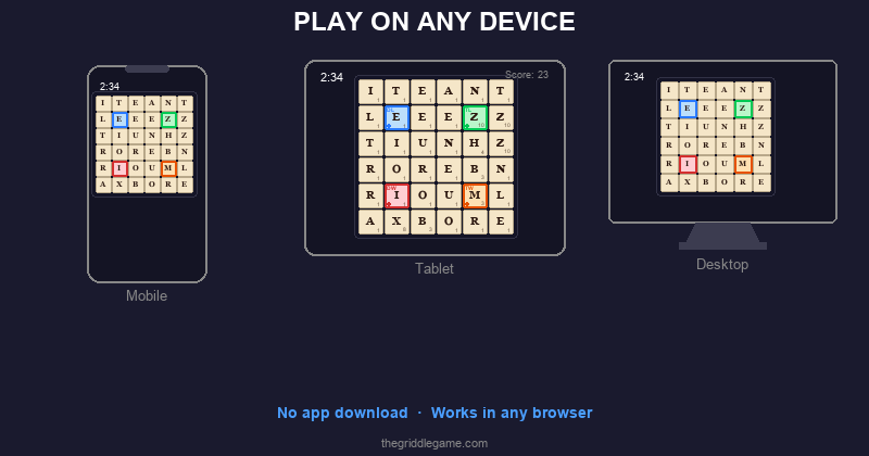
One of Griddle's design principles is that it should work everywhere — your phone at the coffee shop, your tablet on the couch, or your desktop at work. No app to download, no platform restrictions, no compatibility headaches. This post covers how Griddle adapts to different devices and screen sizes, along with tips for getting the best experience on each one.
Supported Browsers
Griddle works in any modern web browser. Here's a quick compatibility overview:
| Browser | Desktop | Mobile |
|---|---|---|
| Chrome | Full support | Full support (Android, iOS) |
| Safari | Full support (macOS) | Full support (iOS, iPadOS) |
| Firefox | Full support | Full support (Android) |
| Edge | Full support | Full support |
Griddle uses standard web technologies (HTML, CSS, JavaScript) with no proprietary plugins or extensions required. If your browser can run modern JavaScript (ES2022+), Griddle will work.
Playing on Your Phone
Mobile is the most popular way to play Griddle. The game's responsive design automatically adjusts the layout to fit your screen, with the 6×6 grid sized to be comfortable for tap interaction on any phone screen.
Tips for Mobile Play
- Add to home screen. On iOS, tap the Share button and "Add to Home Screen." On Android, tap the menu and "Add to Home screen." This creates an app-like icon that opens Griddle instantly — no address bar, no tabs, just the game.
- Portrait orientation works best. The layout is optimized for portrait mode on phones. The board sits at the top with controls and found words below.
- Use your thumb. The tiles are sized for thumb tapping. You don't need to tap with surgical precision — the hit targets are generous.
- Try drag selection. If you enable the Drag Select beta feature, you can swipe across tiles to form words — a natural gesture on touchscreens that many players find faster than individual taps.
Playing on a Tablet
Tablets offer a great Griddle experience thanks to larger screens and comfortable tap targets. The game adapts to both portrait and landscape orientations on tablets, with the board centered and controls easily reachable.
Tips for Tablet Play
- Both orientations work. Portrait gives you a taller layout with more room for the found words list. Landscape gives you a wider view. Try both and see which you prefer.
- Prop it up. Playing with the tablet in a stand or case at a comfortable angle is easier on your hands and neck than holding it. A three-minute game in a stand feels like playing a board game.
- iPad Split View. On iPad, you can run Griddle in Split View alongside another app. The responsive layout adjusts smoothly to half-screen width.
Playing on Desktop
Desktop browsers provide the classic Griddle experience with mouse clicks. The layout takes advantage of wider screens to arrange the board, controls, and word list comfortably.
Tips for Desktop Play
- Mouse clicks for selection. Click tiles to select them, click Submit to submit. The workflow is fast and precise with a mouse or trackpad.
- Browser bookmarks. Add thegriddlegame.com to your bookmarks bar for one-click access. Some players pin it as a tab that stays open all day.
- Keyboard shortcut (Enter). After selecting your tiles, you can press Enter to submit the word instead of clicking the Submit button.
- Window sizing. Griddle works at any window size. You can shrink the browser window without losing functionality — the layout adapts responsively.
The Responsive Design
Griddle uses a responsive layout built with CSS flexbox that adapts to the available viewport. Here's how the key elements behave across screen sizes:
- Board grid: Scales proportionally to fit the available width while maintaining square tile proportions. On narrow screens, tiles are smaller; on wider screens, they're larger. The board never overflows or requires scrolling.
- Controls: Shuffle, Submit, and Pause buttons stack or align depending on available width, remaining easily tappable at any size.
- Found words list: Scrolls independently within its container. On tall screens, you see more words; on short screens, the list scrolls within its allocated space.
- End screen: Score and stat cards adjust their size on constrained viewports, with the found words list remaining scrollable and action buttons always visible.
The game uses 100dvh (dynamic viewport height) to
fill exactly the visible screen area, accounting for mobile browser
chrome (address bars, toolbars) that can change size as you scroll.
This prevents the common mobile web problem of content hiding
behind the browser's interface.
Data Portability
One important caveat: because Griddle stores your data in your browser's localStorage, your stats, streaks, and badges are tied to a specific browser on a specific device. If you play on your phone's Chrome browser, your stats won't appear when you play on your desktop's Firefox.
This is a deliberate trade-off for privacy. Since there's no account system and no server-side storage, your data stays entirely on your device. The upside is complete privacy; the downside is no cross-device sync.
Dark Mode and Light Mode
Griddle supports both dark and light color themes. The game automatically matches your system preference — if your device is set to dark mode, Griddle appears in dark mode (dark background, light text). If your device is in light mode, Griddle adapts accordingly with lighter backgrounds and darker text.
Both themes are fully supported with optimized contrast ratios for readability. Tile colors, bonus square indicators, and selection highlights are all adjusted per theme to remain clear and visually distinct.
Accessibility Features
Griddle includes several features designed for accessibility:
- Semantic HTML: All interactive elements use proper ARIA roles and labels, making the game navigable with screen readers.
- Live regions: The current word display and countdown overlay use
aria-liveattributes to announce changes to assistive technology. - Keyboard navigation: Core actions (submit, shuffle) are accessible via keyboard.
- Color independence: Bonus squares are identified by text labels (DL, TL, DW, TW) in addition to color, ensuring they're distinguishable for colorblind players.
- Touch targets: All buttons and tiles meet minimum recommended touch target sizes for comfortable interaction on mobile devices.
Getting the Best Experience
Regardless of your device, here's a quick checklist for the best Griddle experience:
- Use a modern, updated browser (Chrome, Safari, Firefox, or Edge)
- Add Griddle to your home screen or bookmarks for quick access
- Ensure a stable internet connection for the initial load (subsequent plays use cached data)
- Choose one primary device for daily games to keep your stats consistent
- Try both tap and drag selection to find your preferred input method
No matter how you play — phone, tablet, or desktop — the puzzle is the same, the scoring is the same, and the three-minute challenge is waiting. Play today's Griddle on whatever device is closest.